

ROLE
Product Designer
TIMELINE
2 weeks (2023)
SCOPE
Delivery
TOOLS
Figma, Notion, Google suite
CONTEXT


Why did I choose this project?
In the context of my Product Design bootcamp with the Design Crew, I was given the opportunity to work on Spotify in collaboration with two other product designers.
Does Spotify even need an introduction?
THE PROBLEM
How do you implement a concert ticket feature to the Spotify app?
Objectives:
💵
Financial
Increase revenue for Spotify, artists, concert halls & festivals.
🫶
Promotion
Promote rising artists concerts to kick-start their career, based on likes & localisation.
📍
Position
Position Spotify as a key local player within music communities.
ROADMAP
1.
Ideation
Generating many ideas and choosing the best ones.
2.
Benchmark
Getting inspired by competing and related services.
3.
Prototyping
It's time for our solutions to come to life.
4.
User tests & V2
Getting feedback from our users and fixing the issues.

About my role
'I was involved in every step of the design process, with a particular focus on UI and design system coherence.'
IDEATION


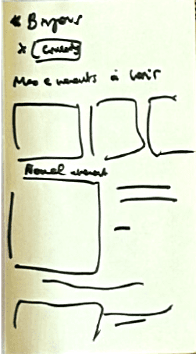


🤟 What we kept
Concerts section on the homepage
Payment funnel
Detailed event page with CTA
Venues page
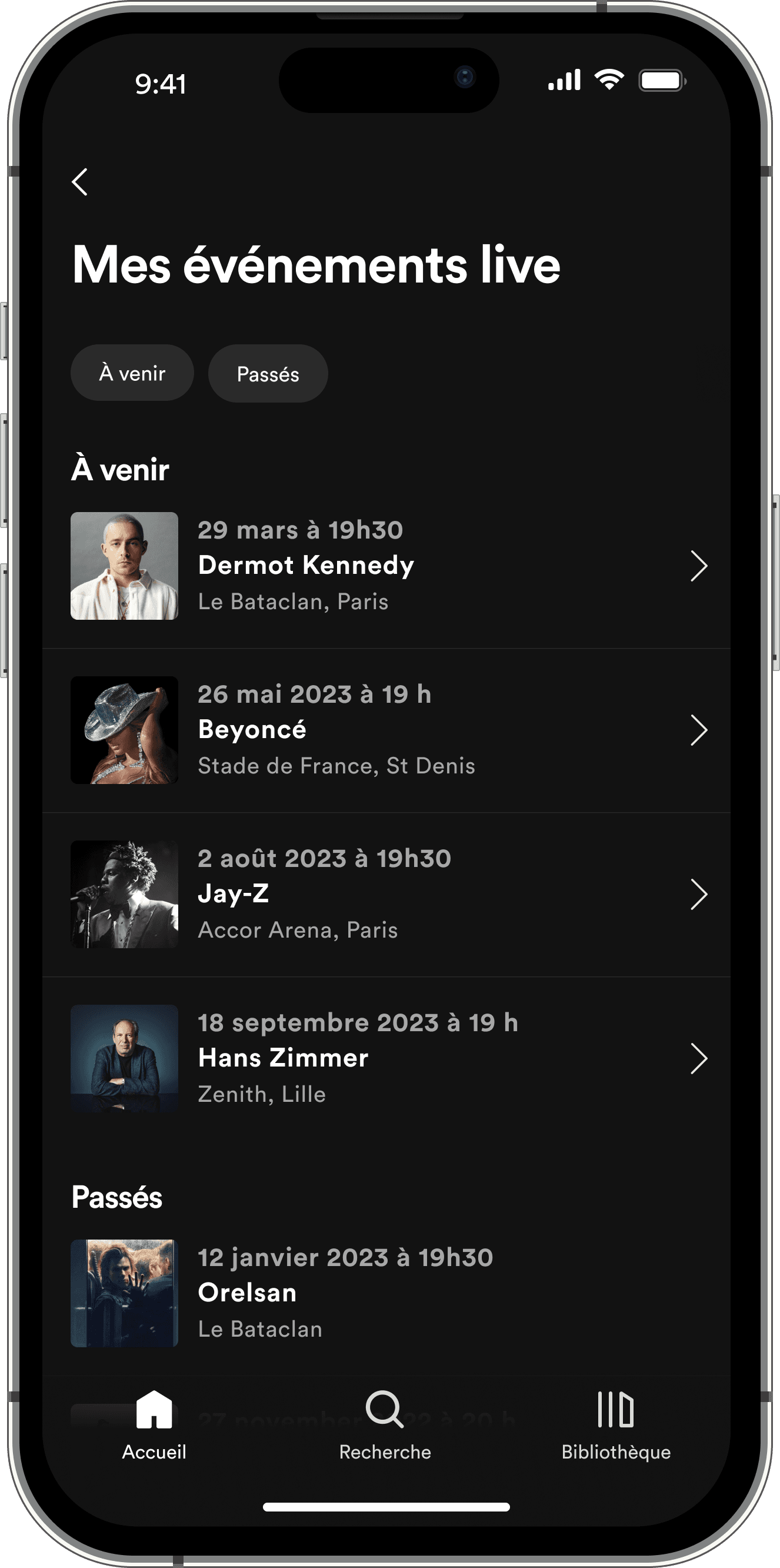
Concerts tickets wallet
Concerts category
🗑️ What we didn't keep
Early access for super fans
Alerts and notifications
BENCHMARK
In order to come up with the design of our solutions, we took inspirations from the best concert tickets app out there.
Shotgun
-> Filter feature to find specific concerts
Dice

-> Modern tickets purchase experience
Fnac

-> Detailed concerts pages
PROTOTYPING
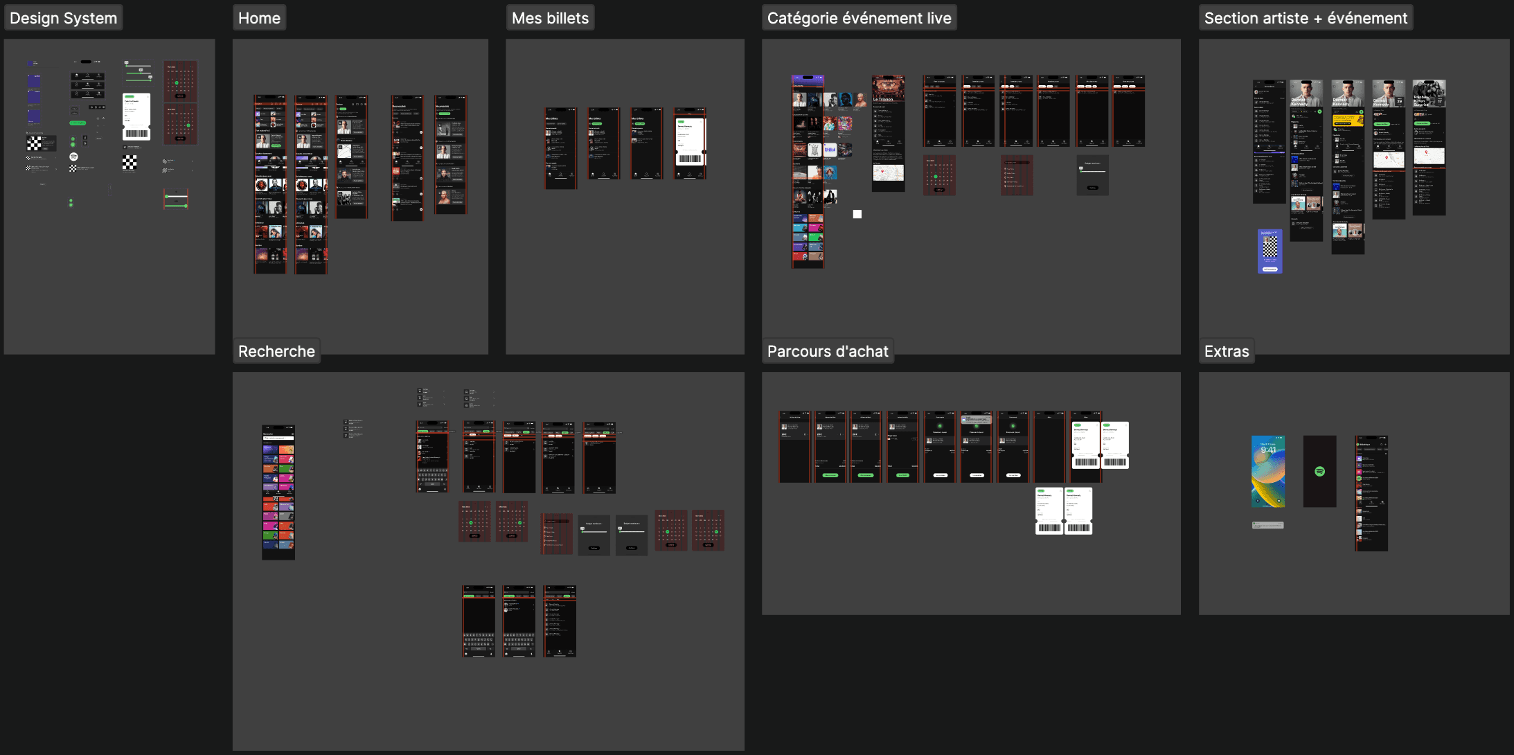
Whenever possible, we tried to work with Figma components to make the process of iterating after the user tests much easier.
An excerpt of our Design System
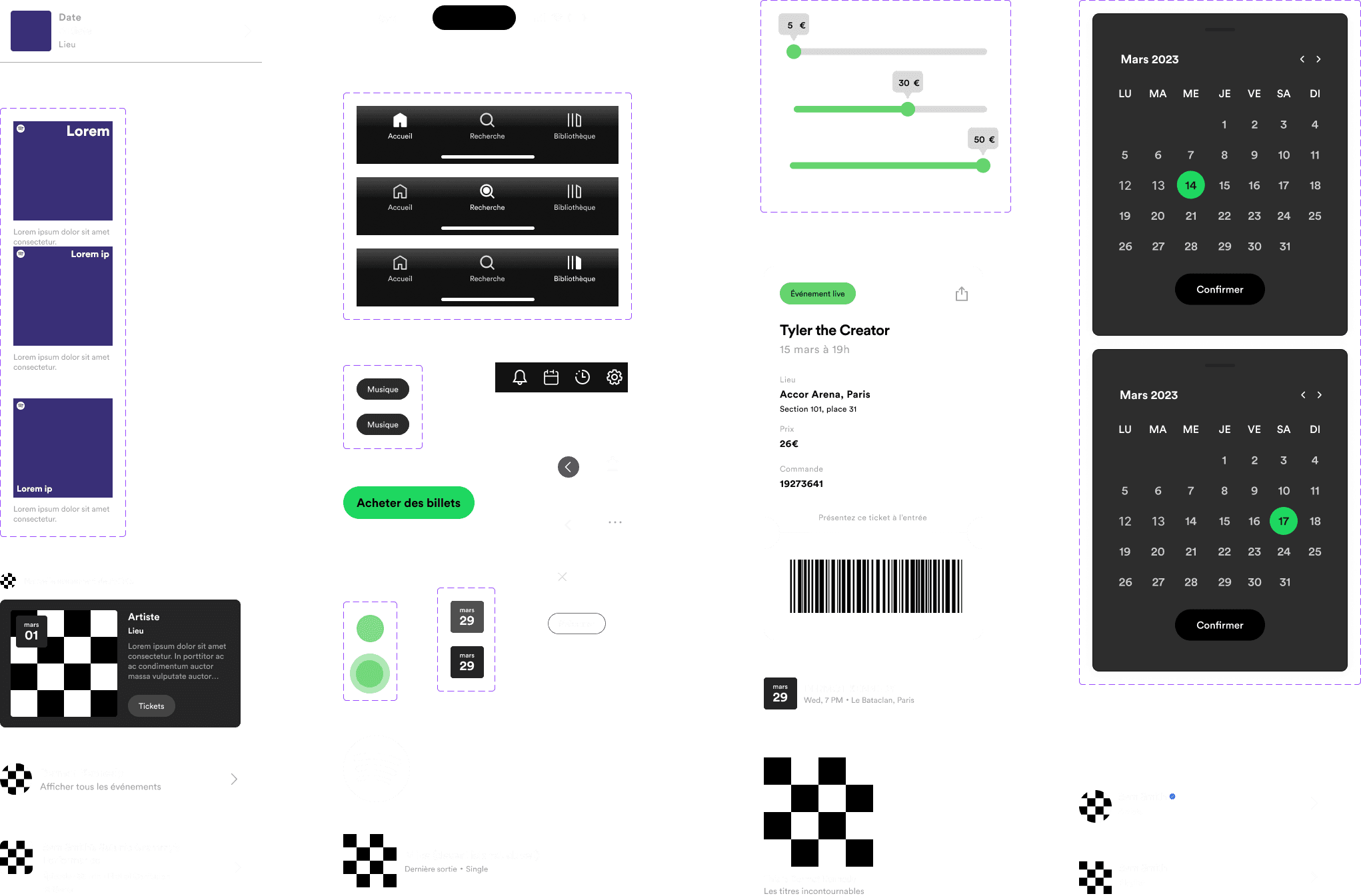
The design of the Spotify app is very mature. The major challenge associated with working on it was preserving the consistency of its UI.
Our V1
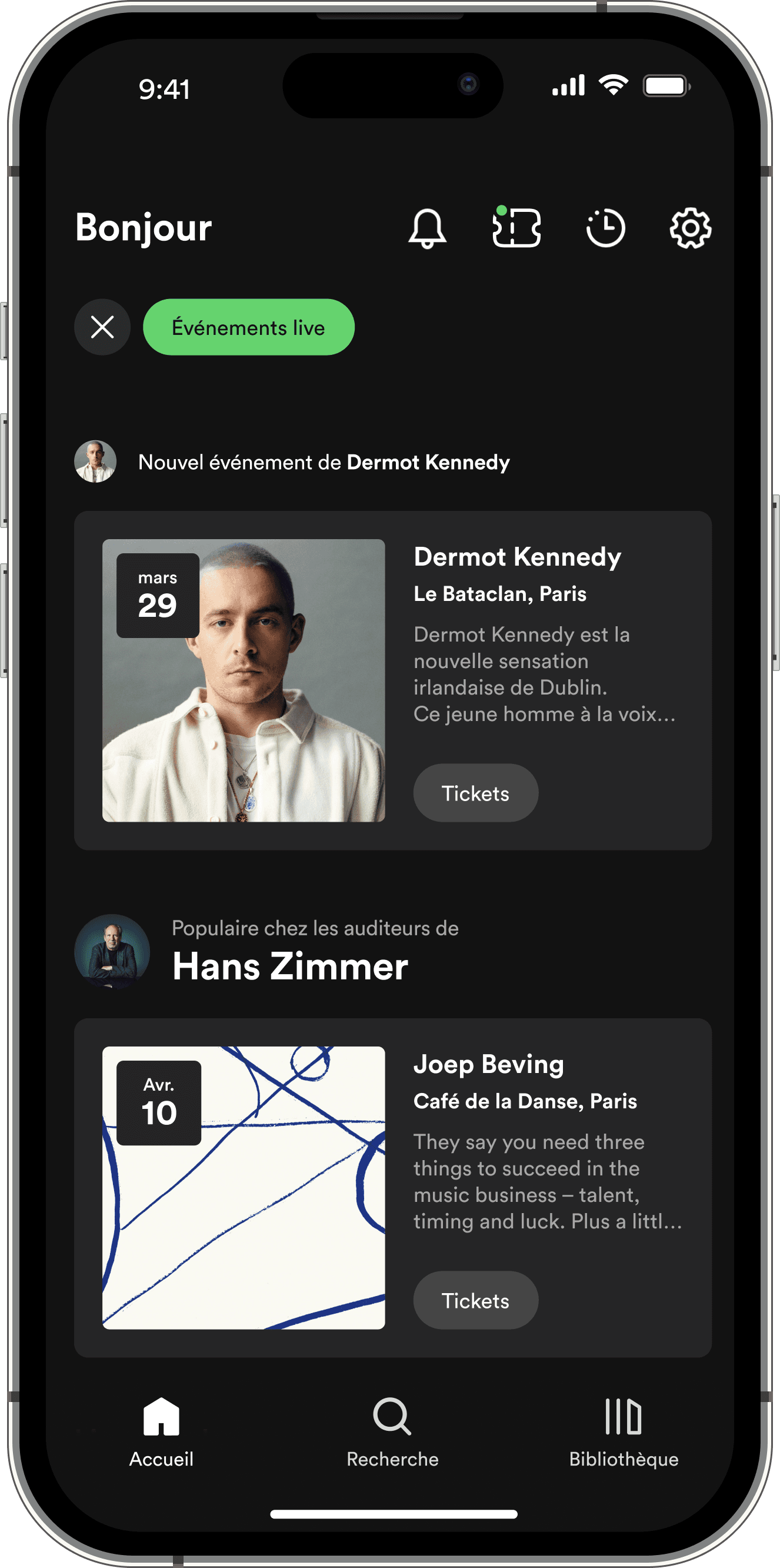
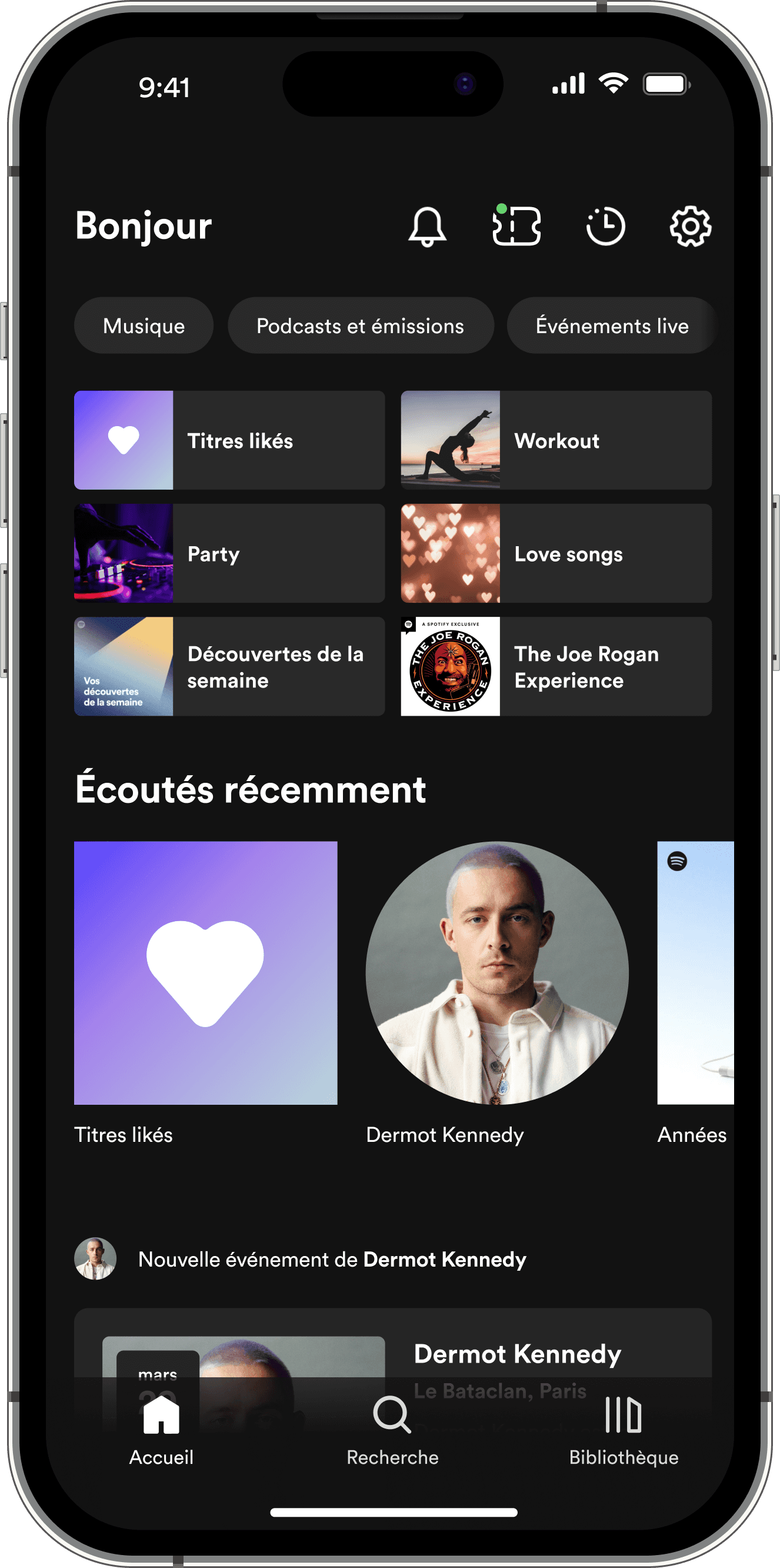
New ways to discover concerts
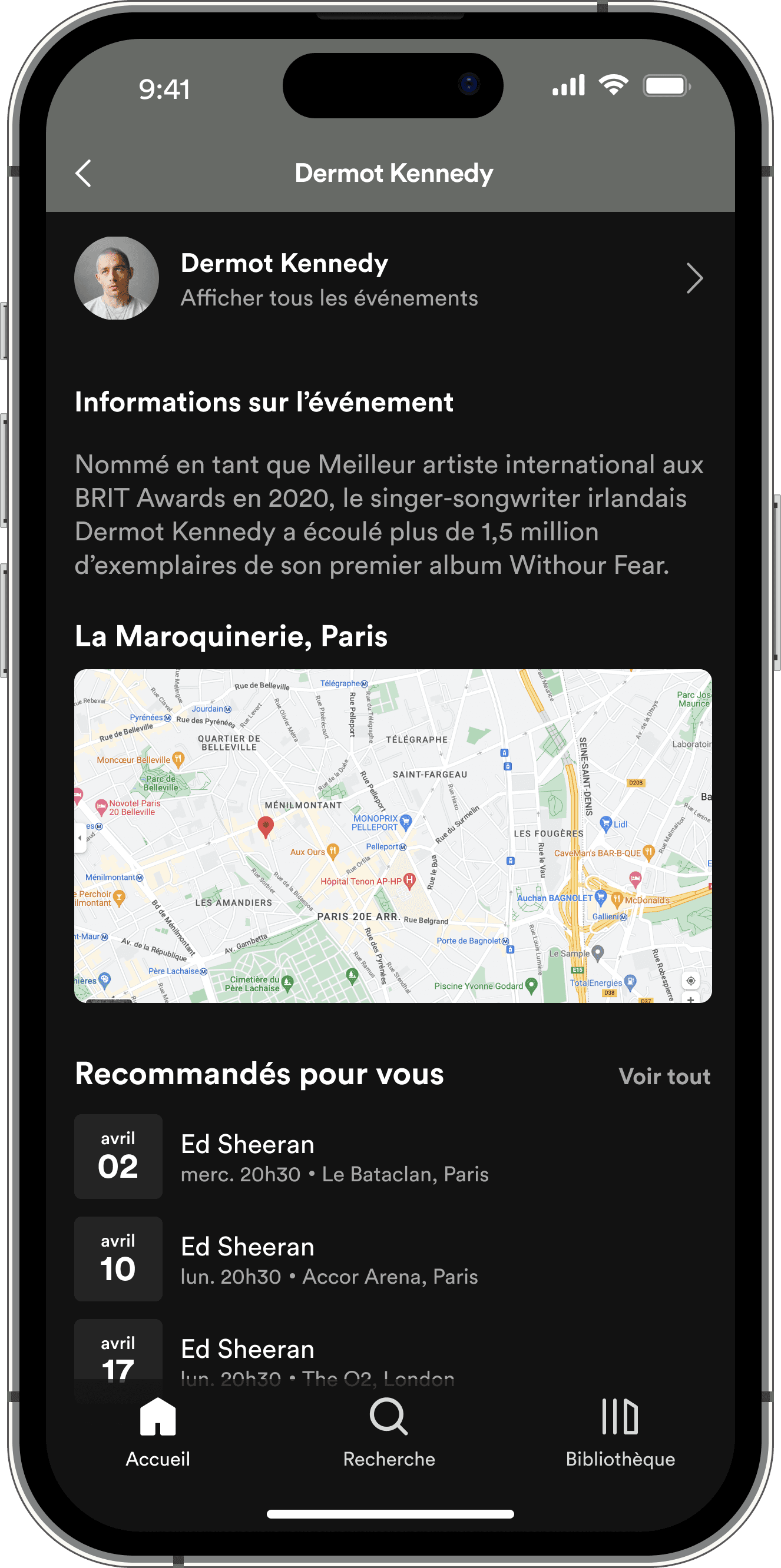
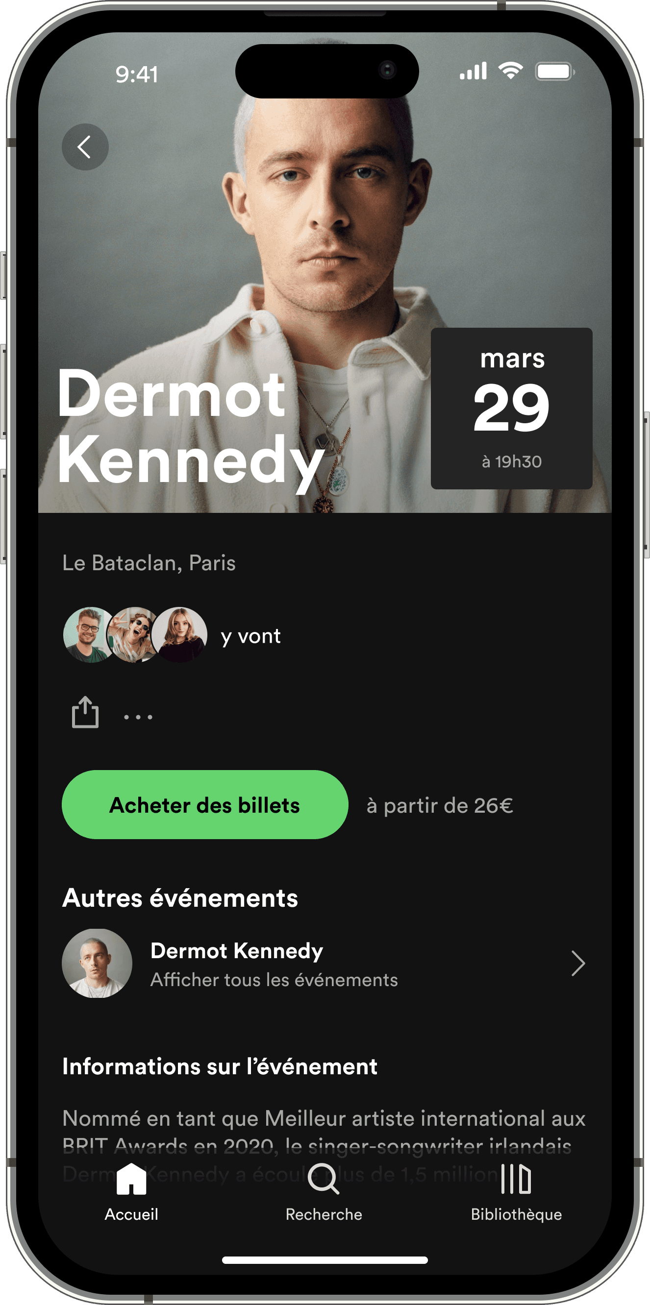
Part of the complexity involved in adding a new type of content to Spotify is that it has many entry points to discover things.
We added the ability to find concerts throughout the app to preserve consistency (home page, notifications, artist page, search, etc.).
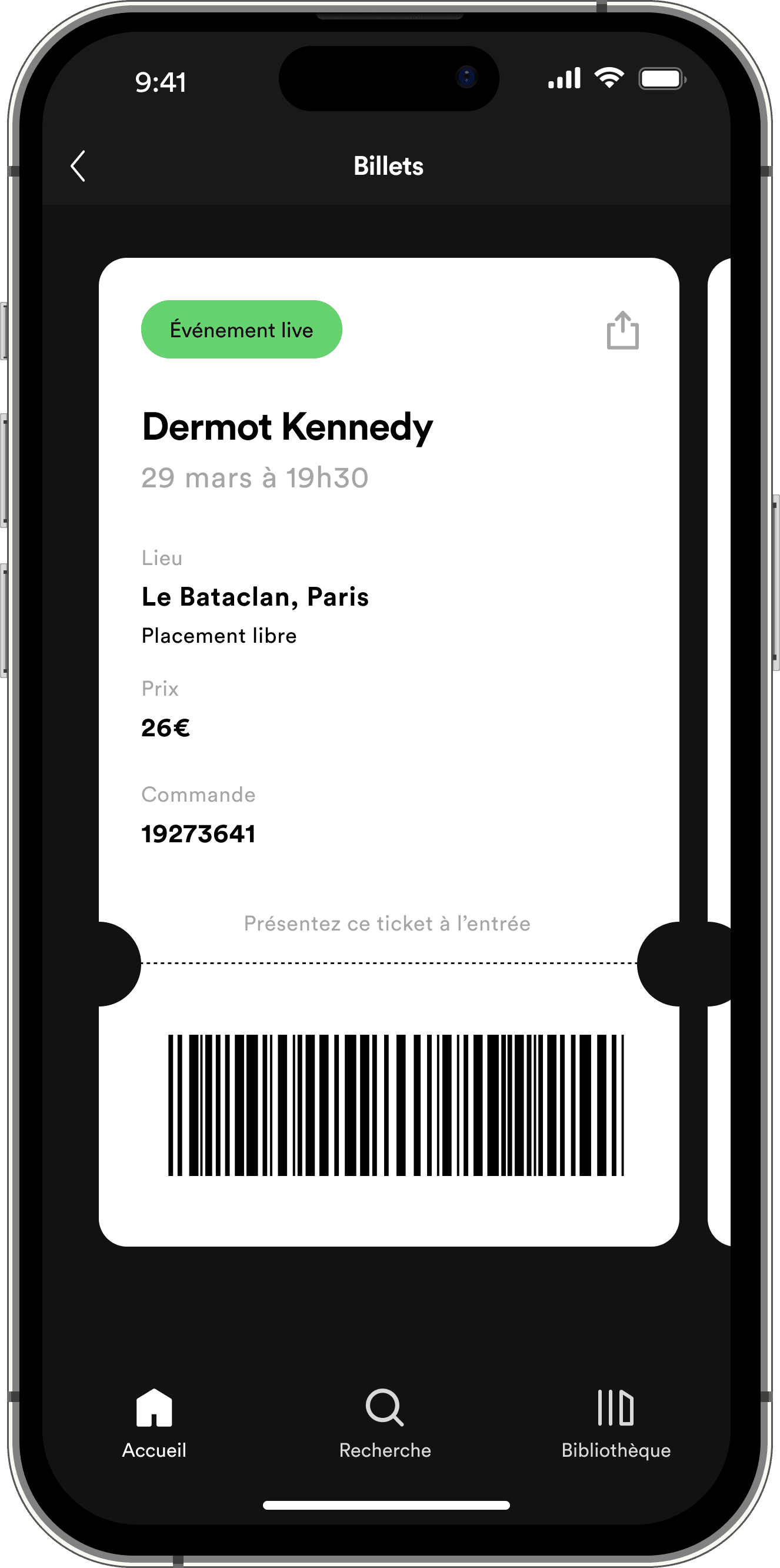
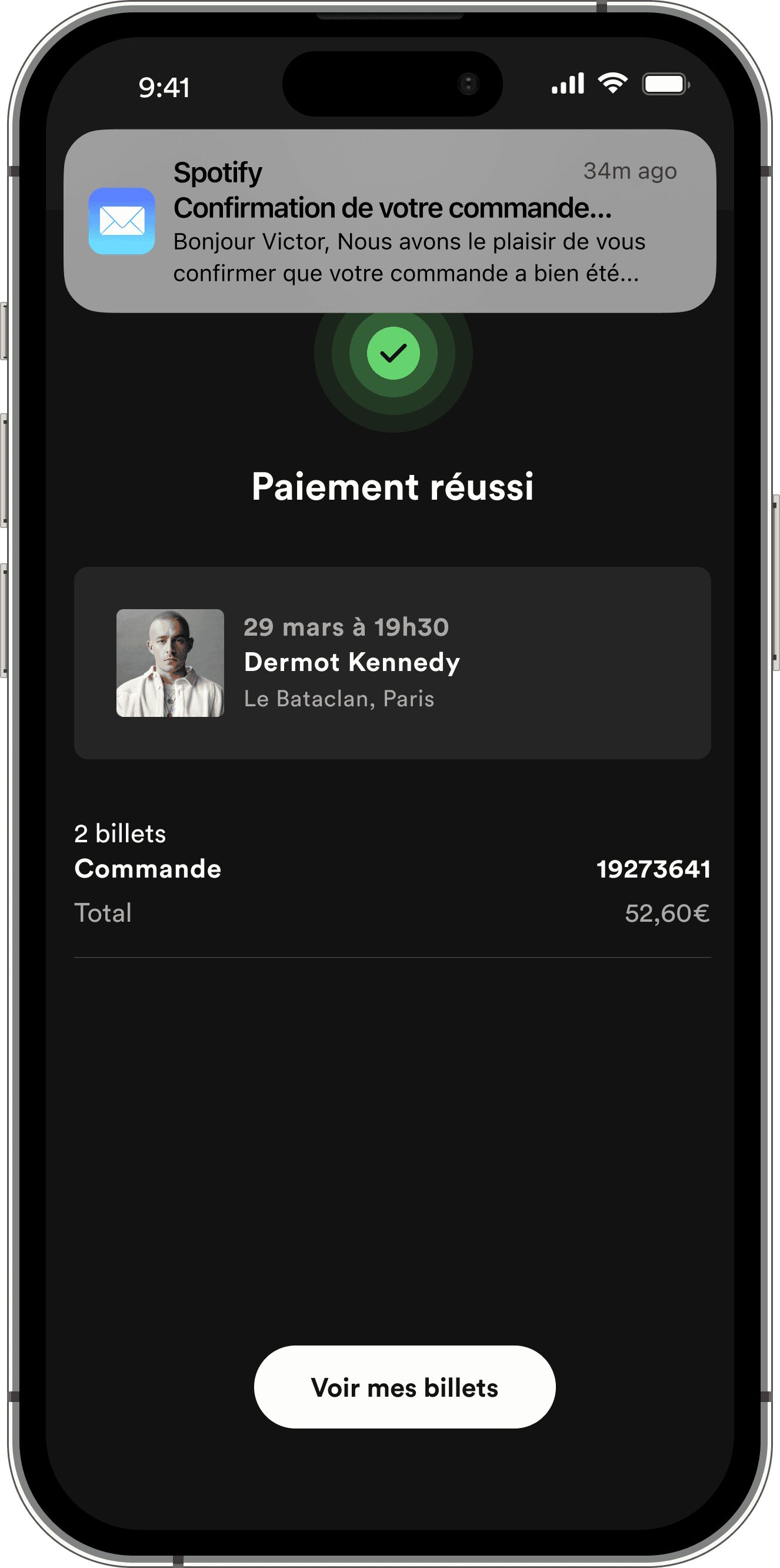
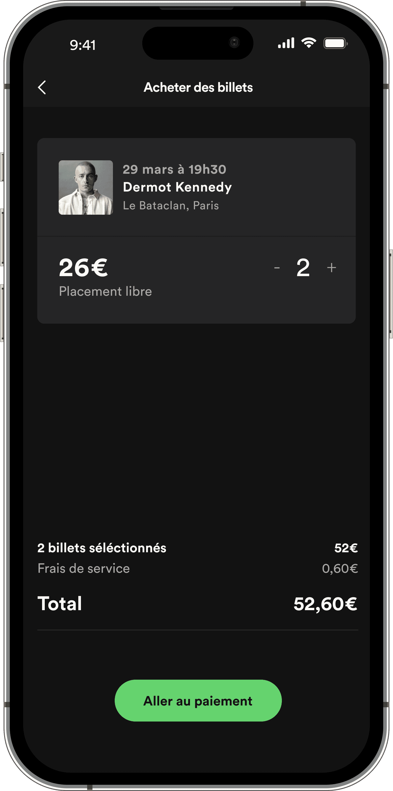
A streamlined payment funnel
Spotify's design is often associated with minimalism and sobriety.
We implemented a payment funnel that is as frictionless as possible, with few steps and only the important information.
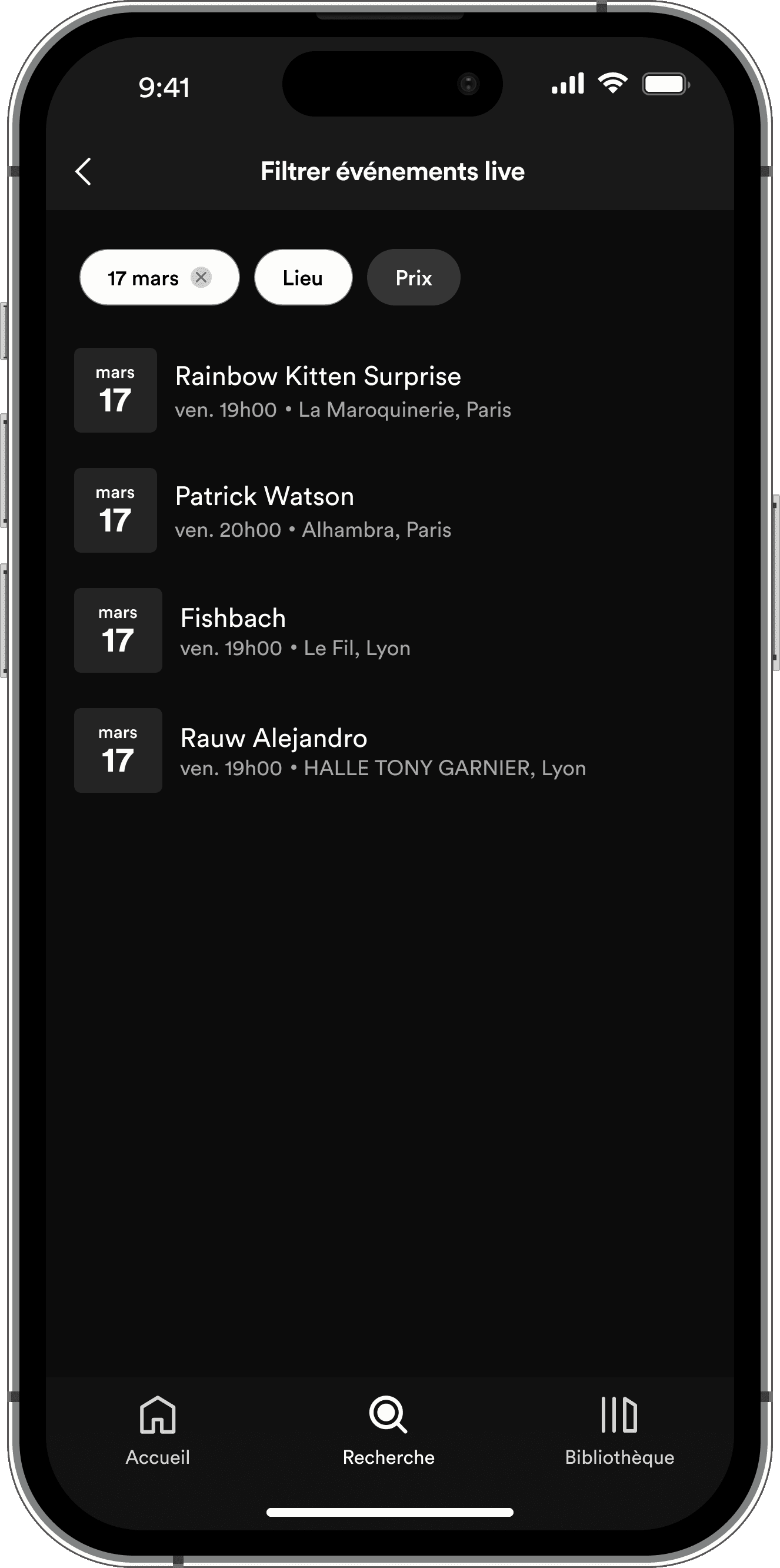

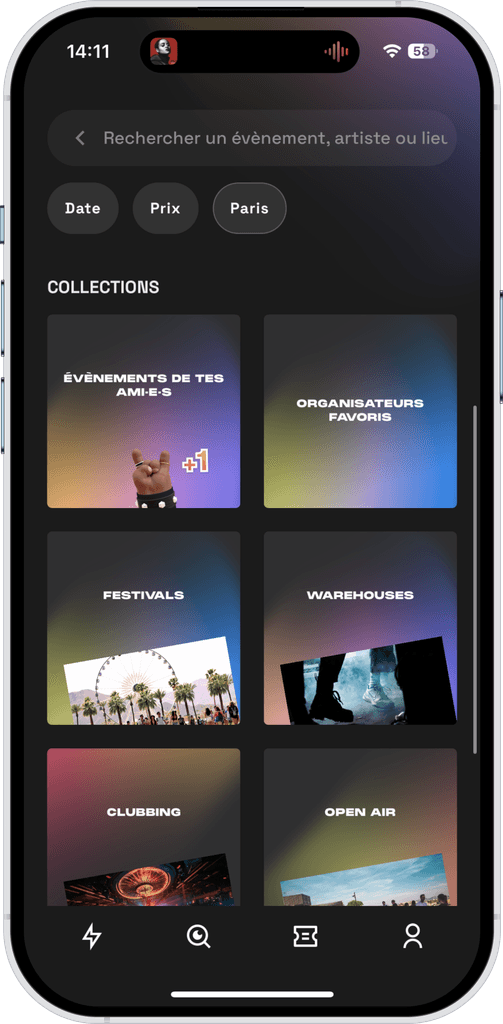
Concerts category with more options
The previous concerts category didn't have subsections like the podcast or music ones to discover different types of events. It was a bit static and bland.
We created various subsections such as : 'For you', 'Your friends are going', 'Cool new venues', 'Around you', etc. We also implemented a dedicated filter section.
USER TESTS
To deliver a successful solution and create a great user experience, we performed a series of user tests.
Objectives
Finding concert events
Test how easy it is to find events and which entry point they favour.
Purchase funnel
Test if our purchase and payment experience is simple and quick to perform.
Finding their tickets later-on
Test how easy it is for users to find their tickets on the app after having purchased them.
Filtering concerts
Test how easy it is for them to use our concerts filter feature and if they managed to get their desired results.
Test parameters
Semi-directive interviews
30min
Via Google Meet
4 men / 1 woman
5 testers
Mostly technophiles
✅ What worked
⛔ What didn't work
OUR V2
Time to sit back and enjoy the show.
HANDOFF
Our figma file
NEXT STEPS
Although the tasks below exceed the scope of the original project, it would have been worthwhile to explore them given more time.
🧪
More tests
After our first series of test, we improved our solution. It would be useful to now test those iterations.
👀
Alignment
Organise a session with PMs and developers to make sure everyone is up to date regarding the project.
📦
Handoff
Double check once again that our design files are organised and documented.